Tuesday, December 8, 2015

Final Project - Land Cover Change

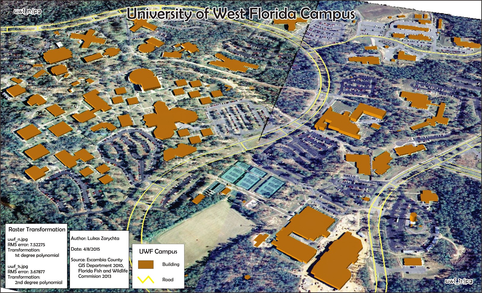
For my final project I compared images of the Lake Tahoe region from 1999 and 2010, and compared the land use/cover over those time periods. I used data provided for the final, which included images of the region in those two time periods.

First I used Stack tool in ERDAS to combine multiple band files of the 2010 image. Then I used Subset and Chip tool to reduce the size of the of the 2010 image to be the same as the 1999 image. This was done using the Inquire box, and I repeated the process for the 1999 image, just to be sure that both images cover the same area.

Then I performed an Unsupervised Classification on each image. Once completed, I reclassified the data into eight groups, and calculated area in acres for each group. Then I could manually calculate the percentage of land cover of each of the eight groups.

Sunday, November 8, 2015

Module 10 - Supervised Image Classification

In Module 10 we learned to create a supervised classification of data. This process begins with manually creating signature points. These points train the software to look for similar pixels and assign them to an appropriate category. Once all categories are created, and each category may have multiple signature points, it is wise to look for Spectral Confusion.

By looking at Histogram Plots and Mean Plots we can see which categories may be overlapping, thus assigning pixels to the incorrect classification. Creating Distance image helps to identify areas that are likely to be mislabeled. After using above tools to determine which spectral bands are closest together, we can change the spectral bands of the image to minimize Spectral Confusion. Once all that is done we can combine like categories into a single category, such as Agricultural 1 and Agricultural 2 into Agricultural.

Once above steps are done we move from ERDAS Imagine to ArcMap to complete the map.

Sunday, November 1, 2015

Module 9 - Unsupervised Image Classification

The map on the left shows unsupervised classification of an area.Unsupervised classification relies on the software to classify the pixels. Once classified I manually assigned each type of pixel into one of five categories, and gave each category a unique and distinctive color.

Most of the process was done in ERDAS Imagine. First, to classify the image into 50 distinct pixel categories. Then, to manually assign each pixel to a new category. Lastly, ArcMap was used to create the final map.

Sunday, October 25, 2015

Module 8 - Thermal Imagery

This map shows the shallow waters along the coast to the West of the gap, located at x: 470000 and y: 3355000. The water West of the gap is much warmer, as shown by the yellowish striations. The water on the East side of the gap is much deeper, as shown by the blue color, lacking the warmth represented by yellow. The actual striation in the warm, shallow water are caused by waves and tidal action that is more pronounced in the shallow waters.

I found this feature as I was looking along the coast and I noticed that the seas side of the coastline showed a lot of temperature variation between the coastal water on the east and west side of the gap. After examining aerial photos, there did not seem to be any correlation between water temperature and urban development along the coast.

Using the band combination of Red 2, Green 1 and Blue 6, the warm, shallow water displayed in yellow. In contrast vegetation and most of urban areas display in blue, and cool , deep water pourple-blue.

Monday, October 19, 2015

Module 7 - Image Preprocessing 2: Spetral Enhancement and Band Indices


In Lab 7 we learned to locate and identify surface features based on their pixel value. Using tools provided by ERDAS Imagine Histogram tool I found the specific peaks in pixel values. Then using the Inquire Cursor I located areas on the image that matched those pixel values.

Then I identified those areas, and adjusted color bands to bring out areas of interest from their background. In the case of the second map, the snow capped mountain peak, no adjustment from true color was needed. This is because white snow cap clearly stands out from the mountain and vegetation color. Third image is that of shallow water with heavy sediment load. The challenge was to bring out the sediment pattern in the water. Under most band variations the sediment pattern was very difficult or impossible to distinguish from deep water. However using red 4, green 2 and blue 1, the eddies in the water popped out very clearly.

Monday, October 12, 2015

Module 6 - Image Preprocessing 1: Spatial Enhancement and Radiometric Correction

In this lab we used ArcMap and ERDAS Imagine to modify remote sensing data. This is done through application of various filters. The two programs used, ArcMap and ERDAS, provide certain benefits and work best when are used in tandem to overcome the limitations associated with each one. 

Saturday, September 26, 2015

Module 5a - Intro to Electromagnetic Radiation (EMR)

In Module 5 we learned to calculate the relationship between wavelength and frequency, and to calculate the energy based on the wavelength. The basic principle is that the shorter the wavelength the greater the energy of the particle.
Then we were introduced to ERDAS IMAGINE software, and learned some of its basic utilities, including how to save your work without the software crashing.
Last part of the exercise was to use ERDAS software to select an area of a larger project area, calculate land area of each feature in it, and export it. Calculating land area involved editing the attribute table and adding another column. Then we imported the file into ArcMap, and created a usable map out of it.

Sunday, September 20, 2015

Module 4 - Ground Truthing and Accuracy Assessment

In lab 4 we did ground truthing. This involves checking and comparing the land use that we determined in Lab 3 to the actual land usage. This is done in a number of ways, but with the limitation we had (such as this being an online course) we used Google Maps. For most features in the mapped area street view was sufficient to determine the actual land usage. Some areas not adjacent to the road required zooming in really close and using associated features to determine actual land usage.

The points that were ground truthed were chosen randomly, though there are other, more methodical ways to select points for ground truthing.

Saturday, September 12, 2015

Module 3 - Land Use Land Cover Classification

This week's assignment was to identify general land use and land cover types from an aerial photo. I used the skills learned from Lab 2, and identify land features mostly based on tone and, more importantly, texture. Combined with recognizing features by size and association, I could narrow down and label trailer park, grocery stores, and small commercial buildings.

Sunday, September 6, 2015

Module 2 - Aerial Photography Basics & Visual Interpretation of Aerial Photography


Module 2 lab focused on basics of visual interpretation of aerial photos. In the first exercise we identified different tones, or shades, of surface features. We also identified varying ground textures. These varied from very fine, smooth water surface, all the way to very coarse thick forest. Once the tones and textures were identified we had to outline them using ArcMap.

In the second exercise we had to identify surface features on an aerial photo based on shape and size, pattern, shadow, and association. Size and shape was useful for recognizing houses, cars, and roads. Shadow was useful for tall features, such as trees and a water tower. Pattern was very useful for identifying waves on the water, parking stripes in the parking lot, and a neighborhood with houses along a street. Last was association. A swimming pool, black rectangle of water in a neighborhood, and a pier, thin, long structure jutting out into the water. As in the first exercise, we used ArcMap to mark and label the features.

Thursday, April 30, 2015

GIS 4043 Final

   The final project for GIS 4043 is an analysis of a preferred corridor for Bobwhite-Manatee Transmission Line Project. Analysis included determining number of houses within the corridor and within a 400 foot buffer around the corridor. Number of schools and day-cares in the same area. This was dine by looking at areal images of the area and digitizing all the buildings within those two zones.
   Further, I used ArcMap to determine the acreage of  environmentally sensitive areas in the corridor. Those areas included swamps, streams, bayous, as well as environmental conservation areas. This was done by intersecting wetlands layer with the corridor, and clipping conservation areas to the corridor. In both cases the new layers we added to the Final geodatabase file I created for this project.
    As for the base map, instead of using aerials as a base, I used a basic map. I chose this because the presentation was supposed to be for a wide audience, and this background would make it clear where this are is supposed to be.

Here is the PowerPoint presentation.

Here is the slide by slide presentation.

Friday, April 24, 2015

Module 13: Final


The final project for GIS 3015 is a map, created for The Washington Post, which shows ACT data for the year 2013 by using skills and techniques learned throughout the semester. As part of this assignment, we were to find the applicable data, convert it into a format usable by ArcMap, download the correct shapefile and project it to a usable projection. Once the data was obtained, the map could be created with those data sets using the Gestalt principles learned during the course. The final map represents two data sets: the average ACT score for each state and the percentage of graduating students that took the ACT per state. Both data sets were created in Excel and joined with the Attribute Table of the base map. Then the data was classified, using the Natural Breaks classification. Map insets were used to show states outside the lower 48. Also an inset map of the Northeast to show data for all the small states that would otherwise be covered by the thematic symbols.

Thursday, April 9, 2015

Week 13 - Georeferencing, Editing and ArcScene

 The last (but not final) assignment for the class focused on georeferencing an image, editing features and using ArcScene. First part of the assignment was to take an aerial image of an area and georeference it. That is, to assign it a spatial properties, give it a place in the world. That is done using the Georeference toolbar by connecting a point on the unreferenced image to a point with a known location. You should have at least 10 locations connected that way, and those locations should be spread out throughout the image. Avoid choosing locations that is in a line, or that are clustered closely together.

Second part consisted of editing features. In this case adding a building and a road based on previously referenced image. Other than steps needed to start, save and end editing, this works a lot like most drawing programs. Once drawn, data was added to the attribute table in order to use it later on in ArcScene. Last part of creating this map included adding an eagle nest, creating a double buffer around it, and linking a web address of it's picture.

Third part of the assignment involved using ArcScene to create a 3d image of UWF campus. Using Extrude tool all buildings were given appropriate heights. This is were adding building height to the newly created building in the attribute table came in.


Sunday, April 5, 2015

Module 12: NeoCartography/ Google Earth

In this module we used one of the previously created maps and convert it to a file format compatible with Google Earth. The image included here shows a map of South Florida from Module 10, displayed on Google Earth. That part of assignment involved taking a map in ArcGIS, converting it into KMZ file, and opening it in Google Earth. Second part of the assignment involved repeating the above process, but with only a single layer (South Florida counties in my case). Third and final part of the assignment involved making a video tour of high population areas in South Florida, zooming in/out and rotating the camera to show the 3d buildings, and doing all of it with tool provided only by Google Earth.

Wednesday, April 1, 2015

Week 12 - Network Analysis/Geocoding & Model Builder

Map on the lest shows EMS stations in Lake County, Florida. This was the first part of the assignment, geocoding, which is assigning street addresses to location on the map. This is done with the use of geocoding tools, though some location may not be assigned an address automatically. In those cases we used Google Earth to locate the EMS stations, and then picked the correct address from the list of possible ones.

The second part of the assignment involved Network Analysis and creating a route. This is shown in the inset map. Using Network Analysis tool is somewhat involved, as it uses data based on specific data and time to calculate the route. 

Module 11: 3D Mapping

In Module 11 we learned about 3D mapping. This included using mainly ArcScence, but also ArcGlobe to a small extent. Exercises included creating basic 3D map, with graduated elevation colors, river layer, and points points of interest. Other exercises focused on using exaggeration tool to show elevation patterns in otherwise relatively flat area. Also using lighting to show elevation patterns, extruding features from 2D shapes, and extruding feature to an extent based on certain value (such a property value).

Finally we learned to create out of a 2D shapefile a 3D building footprint with actual building heights. Then we imported that 3D model into Google Earth, and displayed it on the Google Earth globe, in it's actual location.

Monday, March 23, 2015

Week 11 - Spatial Analysis of Vector & Raster Data/Vector Analysis

Weeks 9, 10 and 11 covered spatial analysis of vector and raster data, though there was no map created in weeks 9 and 10. In week 11 we created a map of DeSoto National Forest, with campsite areas that follow a number of specific restrictions. 

Using ArcMap I created buffer zones of certain size around lakes, rivers and roads, than using the Union tool I combined them into a single layer. Then using Erase tool I removed all the possible campsite areas that were also conservation areas. Each step created a new file, which I added to my geodatabase file.

Thursday, March 19, 2015

Module 10: Dot Mapping

In Module 10 we learned to create a dot map in ArcMap. The map on the left shows the population distribution of South Florida. The population dots are placed over a map of cities and water features of South Florida. 

Large part of the lab assignment was to create a good balance between the dot size and dot value. This is important because if the dots are too small, they appear insignificant, but if they are too large they will bleed together and appear as a blob rather than a dot map. Dot values matter, because if the values are too small, you will have too many dots and the map will be too crowded and difficult to interpret. If the value is too large dots will misrepresent the data, both due to the rounding to the nearest value, and due to spatial distribution. Too few dots will make the data appear as if it was only present in specific areas, rather than distributed over a larger area.

Sunday, March 8, 2015

Module 9: Flowline Mapping

The map this week shows migration statistics for the year 2007. The thickness of the flowlines is proportional to the number of people coming from each region/continent. The inset map of United States shows percentage of immigrant population in each state.

There were two base maps provided for the lecture, and the data came from the U.S. Office of Immigration Statistics. All the work was done in CorelDRAW. This work consisted of drawing the flowlines, setting region/continent colors, setting up background image, adding text, and creating legend for the inset map.

Sunday, March 1, 2015

Module 8: Isarithmic Mapping

Continuous Tint 
Maps created this week show the 30 year precipitation in the state of Washington. Both are isarethmic maps, one using continuous tint, and the other using hypsometric tint with contours. Both maps use the same color ramp.
Hypsometric Tint with Contours
Both maps were created using ArcMap. Continuous tint map was very straight forward, as the data was already in the appropriate form, and only required a choice of a color ramp. The hypsometric tint map required the data to be classified. I chose manual classification with ten classes. once my data was classified I used the Contour tool to add the contour tool to add the contour lines, using the same ranges as I did for the data classification.

Saturday, February 28, 2015

Weeks 7/8 - Data for GIS and Data Quality/Data Search


 The two maps above show various aspects of Santa Rosa County, Florida. In this case its a map of invasive plants and ecological resource areas imposed over a georeferenced aerial image of a part of Santa Rosa County, and the other map shows public managed lands and elevations in the whole county. Both maps show roads, cities and rivers.

The purpose of this two week assignment was to find the correct shapefiles (mostly using FGDL and LABINS websites), project them all in the same projection, and clip the shapefiles to usable extents.

Saturday, February 21, 2015

Module 7: Choropleth & Proportional Symbol Mapping

This week we created a choropleth map with proportional symbols layered on top of the map. The map shows population density of Europe (per square kilometer), with wine consumption (in liters/capita) overlayed on top of the population map. Included are also two inset maps, one for male and one for female population percentages.

For the population density map I chose yellow to red color scheme, as the colors are easy to distinguish from each other, and standout well against the blue background. For male/female map insets I chose blue and pink color gradients to easily identify male and female maps.

The map was created in ArcMap, though the wine bottle symbol used was adjusted in Corel. All choropleth maps were created using the Symbology/Quantities/Graduated Colors menu. In case of population density I used Quantile data classification, as it showed the most variation on the map. With male/female insets, I used natural breaks classification. For wine consumption I used Symbology/Quantities/Graduated Symbols menu. I used graduated symbols, as proportional symbols covered too much of the map, and they were difficult to distinguish from each other.

Tuesday, February 17, 2015

Week 6 - Projections Part II

Above map shows a small sections of Escambia County, and either in use, closed, or abandoned petroleum storage tanks in the area. The petroleum tank data is courtesy of Florida Department of Environmental Protection.

This week's lab focused on acquiring correct data files, projecting them to the correct coordinate system, adding missing data to XY Data tables, and combining everything we have learned so far in this course to create a map using ArcMap.

Friday, February 13, 2015

Module 6: Data Classification

This week's map presents the percentage of the population over the age of 65 in Escambia County, Florida, divided up into U.S. Census Bureau tracts. Data in each inset map is distributed using a different method, Quantile, Natural Breaks, Equal Interval and Standard Deviation. Standard deviation distribution seems to be the least appropriate for this map, as it does not show the actual percentages, but instead shows the variation above and below the average.

This map was created in ArcMap, each data distribution shown in a separate data frame. Data distribution was done through the Symbology tab in the data properties, using ArcMap default for each classification method.

Sunday, February 8, 2015

Week 5 - Georeferencing & Projections Part I

This week learned how to change map projections in ArcMap using the 'Project' tool. The above map shows the state of Florida in three different projections, Albers, UTM and State Plane. There are four counties selected on each map, their surface area is listed to easily compare the differences and surface area distortions between these projections.

I created two new data files, each one containing the shapefile of Florida counties in a different projection.  I changed the projections using the 'Project' tool. Then I inserted those new data files into new data frames, which (the data frames) took on the same projection as the first layer in the frame. Then I added an 'Area' column and calculated geometry for that field, getting the surface area of each county. After that I could select the four counties needed for the exercise, create a new layer out of this selection, and use the Symbology tab assign them a color gradient from smallest to largest.

After repeating the surface area addition to the attribute table for each of the maps, I made the map my own. Each map needed its own legend, and items within a layer (specific counties) had to be renamed in the Symbology tab. Last step was to make sure that all the maps are in the same scale and add a common scale bar.

Thursday, February 5, 2015

Module 5: Spatial Statistics

This week's module focused on use and understanding of spatial statistics. The map above shows the distribution of weather monitoring stations in Western and Central Europe (though I would argue that it does not actually include most of Central Europe, geographically or culturally). In addition a mean center (purple star), median center (red star) and directional distribution (orange oval) of the data are shown on the map.

The map was created in ArcMap, using statistical tools provided by the software. The close proximity of the mean and median centers suggests normal distribution of the data. The left-right alignment of the directional distribution shows us an East-West distribution.

Monday, February 2, 2015

Week 4 - GIS Hardware, Software & Programming and ArcGIS Online & Map Packages


This week we focused on sharing the maps we created in ArcMap. Lab exercises were part of ESRI tutorials, available on their website. As part of the exercise we had to imports data into ArcMap, perform some minor manipulations, and share it through ArcGIS Online.

The two maps that I have created, and I use "created" loosely in this case, as I just made slight modification to maps provided for the exercise, I have uploaded to my ArcGIS Online account, and shared them. Of course, first I had to share the maps as Map Packages in ArcMap, verify them for any errors, and upload to my online account. The second map had some intentional errors that had to be corrected before I could upload the map package.


Saturday, January 31, 2015

Module 4: Typography

This week's assignment was focused on using labeling principles learned in the lecture to label number of features of Marathon, Florida. Using CorelDraw we were to import a map of Marathon, find locations we were given and label them. Then we had to insert all the mandatory map elements (title, legend, north arrow, author, sources) and an inset map. Last, but not least, we were to add three personal elements.

Finding the given locations was easy enough, with a plethora of maps available online. I chose to use an italic serif font to label all water bodies. Then I used a sans serif font to label all land features, I used all caps for natural features (keys), and title case for all cultural features. I chose green for the land color, as it is associated with land, and stands out against the blue water background. I used a stock image of deep water surface as the background image.

Labeling water features was simple, as I could fit the name within a feature. At most I had to create a curved path to label along. Both Florida Bay and Atlantic Ocean having the largest labels, being the most important water features on the map. Labeling key was more challenging, as I wanted to have the labels inside the features. This was impossible in couples of cases due to small size of the keys. I ended up placing the labels adjacent to those features, and wholly in the water. Most of the cultural feature labels were also placed in the water. In all cases of land labels, I placed a white halo around the text to make it easier to read, and to have the text stand out over some lines of low importance.

Monday, January 26, 2015

Week 3 - Cartography Using a GIS


This week we created three maps of Mexico: population by state (shown by state), rivers and transportation routes, and topography. The purpose of the lab was to manipulate the metadata, show certain values and hide others. Also learning to label features, adjust the labels, and in general make the map legible and easy to look at.

This map shows the population of Mexico by state. The graduated color range represents the population, from light yellow being the least populated, to dark red representing the most populated. Shades of yellow to red stand out on the background of light green and blue, bringing focus to Mexico. Also I have adjusted the population ranges to cut off at nice even numbers, so they are meaningful to the reader.

Saturday, January 24, 2015

Module 3: Cartographic Design

This week's assignment was to create a map of school in Ward 7 of Washington D.C., and incorporate into it various aspects of graphic design. The map shows elementary, middle and high school in Ward 7, in relation to city streets, highways, water bodies and parks. The larger the school symbol, the more advanced the school, with the largest symbol being used for high schools.

This map was created in ArcMAP. To clear up the background of the map I removed the the surface streets from Washing D.C., but kept the ones in Ward 7. Then I changed background colors of both D.C. area and areas off the map. To contrast this, I used light green as the background of Ward 7, with darker green representing parks. This color let the red school symbols stand out.

Monday, January 19, 2015

Week 2: Own Your Map

Location of UWF Campus in Escambia County, Florida.
The above map shows the location of UWF campus in Escambia County, with relation to major interstates in the county. The inset map of Florida shows the location of the county within the state boundary. This assignment introduced the most basic functionality of ArcGIS software as a graphic design tool to create a nice, clear, and good looking map. 

Saturday, January 17, 2015

Module 2 Lab: Introduction to Graphic Design

Map of Florida, including the state seal and state tree.

The purpose of this assignment was to create a map of the state of Florida for a children's encyclopedia. The map was to contain counties, water bodies, cities, capital, as well as map basics such as an author, sources, north arrow, legend and scale. Additional information I chose to include is the state seal, state tree and the state nickname.

I used CorleDRAW x7 for this assignment. After exporting the map I duplicated the scale, and moved it to a separate layer from the map itself. This let me move the scale around, I just had to be careful not to change its size, or the map's. Then I added a drop shadow to create a darker outline around the state. In the end I imported images of the state tree and state seal.

Sunday, January 11, 2015

Module 1 Lab: Map Critique

Below are examples of two maps, one well designed and one poorly designed.

EasterIsland.jpg

The above is a (mostly) well designed map of the Easter Island. It is well laid out, with the legend and map insets being placed in areas that otherwise would have no data. The data on the map itself if presented clearly, in a legible, uncluttered fashion. The color gradient for elevation makes sense, as it becomes lighter and browner as the elevation increases. Likewise, all labels were placed, if possible, in areas with no other data (in the ocean in this case). The one flaw with this map I can see is the lack of North arrow.
***
HotelsBarcelona.jpg
This a good example of a poorly designed map. The map does not provide any information about what it is supposed to represent. There is no title or legend. No information about the area represented, where in the world it is. Without streets, this map only shows locations of points in relation to each other. The scale and north arrow look like they have been added as an afterthought, after this map was created, which makes the information they provide seem suspect. Its like they are there because they are supposed to be there, but not because they are actually part of the map.

Friday, January 9, 2015

Week 1: Orientation Assignment

Here is my very first map. I was surprised how user friendly the basic utility of ArcGIS is. I chose shades of green for population density because the colors stand out from the city symbols. When I first used yellow>orange>red color scheme, the dark red high population nations made city symbols illegible in high city density areas.

Overall very fun project and a good intro to the software.

Thursday, January 8, 2015

Lukas' Introduction

Who am I and where do I come from?


My name is Lukas Zarychta. I am Polish, and English is not my native language. Currently I live in Baton Rouge, Louisiana, with my wife and two cats.

I have a bachelor degree in both Anthropology and Geography. I am an archaeology field and lab tech, with years of experience in both. I have work on a wide range of archaeological projects, ranging from surveys through what I can only describe as death-swamps, 10,000 year old aboriginal sites, and 19th century sugar production facilities and slave quarters. Having been on the receiving end of GIS, I want to be where the magic happens, as they say.