 The two maps above show various aspects of Santa Rosa County, Florida. In this case its a map of invasive plants and ecological resource areas imposed over a georeferenced aerial image of a part of Santa Rosa County, and the other map shows public managed lands and elevations in the whole county. Both maps show roads, cities and rivers.
The purpose of this two week assignment was to find the correct shapefiles (mostly using FGDL and LABINS websites), project them all in the same projection, and clip the shapefiles to usable extents.
This week we created a choropleth map with proportional symbols layered on top of the map. The map shows population density of Europe (per square kilometer), with wine consumption (in liters/capita) overlayed on top of the population map. Included are also two inset maps, one for male and one for female population percentages.
For the population density map I chose yellow to red color scheme, as the colors are easy to distinguish from each other, and standout well against the blue background. For male/female map insets I chose blue and pink color gradients to easily identify male and female maps.
The map was created in ArcMap, though the wine bottle symbol used was adjusted in Corel. All choropleth maps were created using the Symbology/Quantities/Graduated Colors menu. In case of population density I used Quantile data classification, as it showed the most variation on the map. With male/female insets, I used natural breaks classification. For wine consumption I used Symbology/Quantities/Graduated Symbols menu. I used graduated symbols, as proportional symbols covered too much of the map, and they were difficult to distinguish from each other.
Above map shows a small sections of Escambia County, and either in use, closed, or abandoned petroleum storage tanks in the area. The petroleum tank data is courtesy of Florida Department of Environmental Protection.
This week's lab focused on acquiring correct data files, projecting them to the correct coordinate system, adding missing data to XY Data tables, and combining everything we have learned so far in this course to create a map using ArcMap.
This week's map presents the percentage of the population over the age of 65 in Escambia County, Florida, divided up into U.S. Census Bureau tracts. Data in each inset map is distributed using a different method, Quantile, Natural Breaks, Equal Interval and Standard Deviation. Standard deviation distribution seems to be the least appropriate for this map, as it does not show the actual percentages, but instead shows the variation above and below the average.
This map was created in ArcMap, each data distribution shown in a separate data frame. Data distribution was done through the Symbology tab in the data properties, using ArcMap default for each classification method.
This week learned how to change map projections in ArcMap using the 'Project' tool. The above map shows the state of Florida in three different projections, Albers, UTM and State Plane. There are four counties selected on each map, their surface area is listed to easily compare the differences and surface area distortions between these projections.
I created two new data files, each one containing the shapefile of Florida counties in a different projection. I changed the projections using the 'Project' tool. Then I inserted those new data files into new data frames, which (the data frames) took on the same projection as the first layer in the frame. Then I added an 'Area' column and calculated geometry for that field, getting the surface area of each county. After that I could select the four counties needed for the exercise, create a new layer out of this selection, and use the Symbology tab assign them a color gradient from smallest to largest.
After repeating the surface area addition to the attribute table for each of the maps, I made the map my own. Each map needed its own legend, and items within a layer (specific counties) had to be renamed in the Symbology tab. Last step was to make sure that all the maps are in the same scale and add a common scale bar.
This week's module focused on use and understanding of spatial statistics. The map above shows the distribution of weather monitoring stations in Western and Central Europe (though I would argue that it does not actually include most of Central Europe, geographically or culturally). In addition a mean center (purple star), median center (red star) and directional distribution (orange oval) of the data are shown on the map.
The map was created in ArcMap, using statistical tools provided by the software. The close proximity of the mean and median centers suggests normal distribution of the data. The left-right alignment of the directional distribution shows us an East-West distribution.
This week we focused on sharing the maps we created in ArcMap. Lab exercises were part of ESRI tutorials, available on their website. As part of the exercise we had to imports data into ArcMap, perform some minor manipulations, and share it through ArcGIS Online.
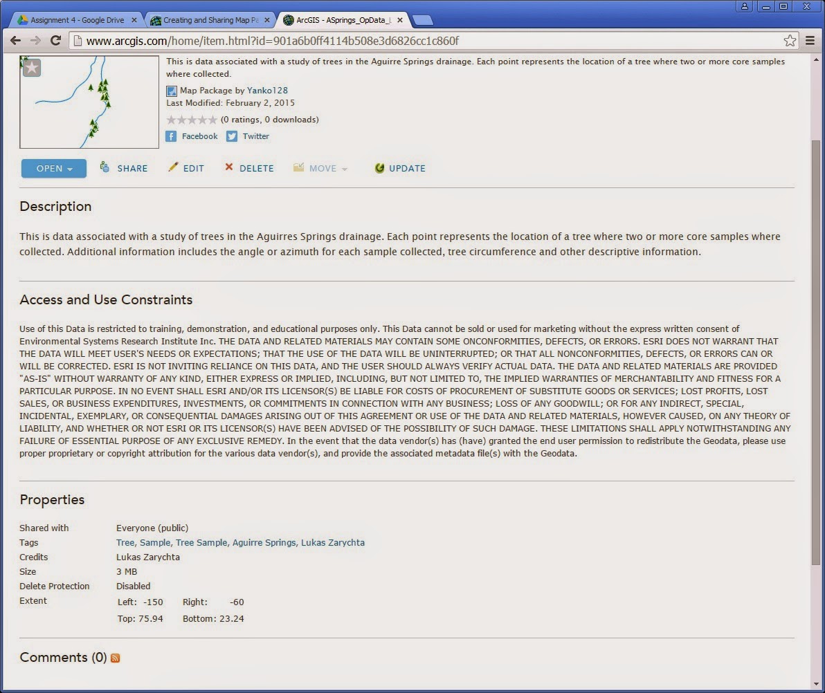
The two maps that I have created, and I use "created" loosely in this case, as I just made slight modification to maps provided for the exercise, I have uploaded to my ArcGIS Online account, and shared them. Of course, first I had to share the maps as Map Packages in ArcMap, verify them for any errors, and upload to my online account. The second map had some intentional errors that had to be corrected before I could upload the map package.


