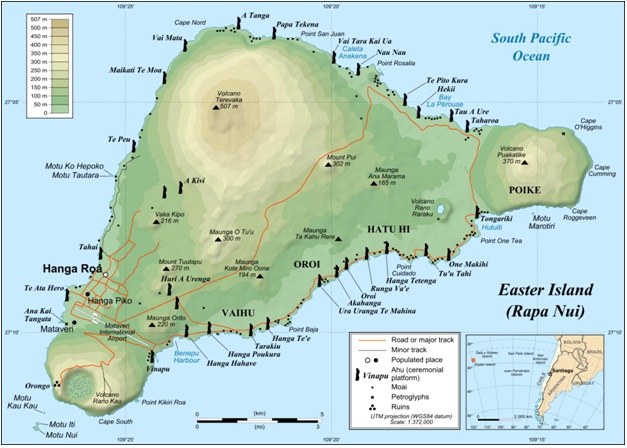
The above is a (mostly) well designed map of the Easter Island. It is well laid out, with the legend and map insets being placed in areas that otherwise would have no data. The data on the map itself if presented clearly, in a legible, uncluttered fashion. The color gradient for elevation makes sense, as it becomes lighter and browner as the elevation increases. Likewise, all labels were placed, if possible, in areas with no other data (in the ocean in this case). The one flaw with this map I can see is the lack of North arrow.
***
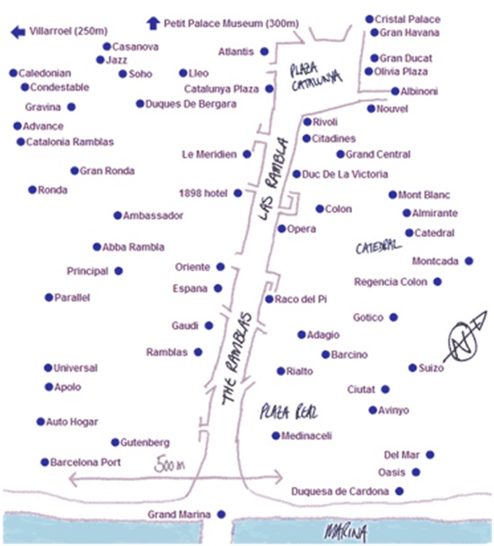
This a good example of a poorly designed map. The map does not provide any information about what it is supposed to represent. There is no title or legend. No information about the area represented, where in the world it is. Without streets, this map only shows locations of points in relation to each other. The scale and north arrow look like they have been added as an afterthought, after this map was created, which makes the information they provide seem suspect. Its like they are there because they are supposed to be there, but not because they are actually part of the map.
No comments:
Post a Comment