The final project for GIS 4043 is an analysis of a preferred corridor for Bobwhite-Manatee Transmission Line Project. Analysis included determining number of houses within the corridor and within a 400 foot buffer around the corridor. Number of schools and day-cares in the same area. This was dine by looking at areal images of the area and digitizing all the buildings within those two zones.
Further, I used ArcMap to determine the acreage of environmentally sensitive areas in the corridor. Those areas included swamps, streams, bayous, as well as environmental conservation areas. This was done by intersecting wetlands layer with the corridor, and clipping conservation areas to the corridor. In both cases the new layers we added to the Final geodatabase file I created for this project.
As for the base map, instead of using aerials as a base, I used a basic map. I chose this because the presentation was supposed to be for a wide audience, and this background would make it clear where this are is supposed to be.
Here is the PowerPoint presentation.
Here is the slide by slide presentation.
Showing posts with label GIS4043. Show all posts
Showing posts with label GIS4043. Show all posts
Thursday, April 30, 2015
Thursday, April 9, 2015
Week 13 - Georeferencing, Editing and ArcScene

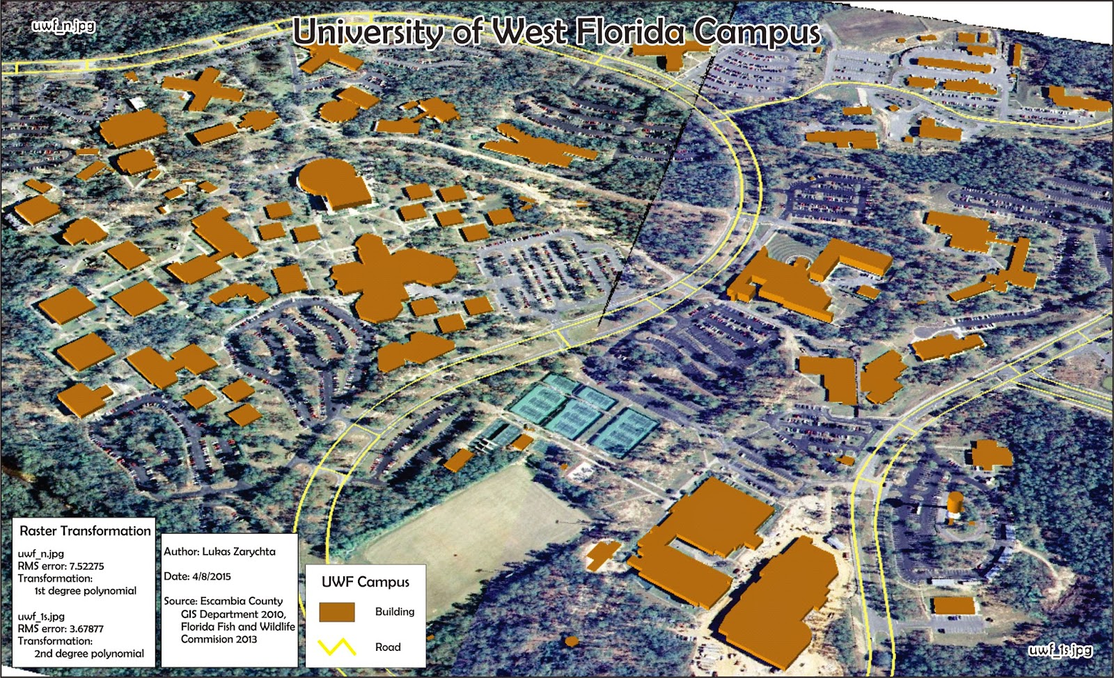 The last (but not final) assignment for the class focused on georeferencing an image, editing features and using ArcScene. First part of the assignment was to take an aerial image of an area and georeference it. That is, to assign it a spatial properties, give it a place in the world. That is done using the Georeference toolbar by connecting a point on the unreferenced image to a point with a known location. You should have at least 10 locations connected that way, and those locations should be spread out throughout the image. Avoid choosing locations that is in a line, or that are clustered closely together.
Second part consisted of editing features. In this case adding a building and a road based on previously referenced image. Other than steps needed to start, save and end editing, this works a lot like most drawing programs. Once drawn, data was added to the attribute table in order to use it later on in ArcScene. Last part of creating this map included adding an eagle nest, creating a double buffer around it, and linking a web address of it's picture.
Third part of the assignment involved using ArcScene to create a 3d image of UWF campus. Using Extrude tool all buildings were given appropriate heights. This is were adding building height to the newly created building in the attribute table came in.
Wednesday, April 1, 2015
Week 12 - Network Analysis/Geocoding & Model Builder

The second part of the assignment involved Network Analysis and creating a route. This is shown in the inset map. Using Network Analysis tool is somewhat involved, as it uses data based on specific data and time to calculate the route.
Monday, March 23, 2015
Week 11 - Spatial Analysis of Vector & Raster Data/Vector Analysis

Using ArcMap I created buffer zones of certain size around lakes, rivers and roads, than using the Union tool I combined them into a single layer. Then using Erase tool I removed all the possible campsite areas that were also conservation areas. Each step created a new file, which I added to my geodatabase file.
Saturday, February 28, 2015
Weeks 7/8 - Data for GIS and Data Quality/Data Search


The two maps above show various aspects of Santa Rosa County, Florida. In this case its a map of invasive plants and ecological resource areas imposed over a georeferenced aerial image of a part of Santa Rosa County, and the other map shows public managed lands and elevations in the whole county. Both maps show roads, cities and rivers.
The purpose of this two week assignment was to find the correct shapefiles (mostly using FGDL and LABINS websites), project them all in the same projection, and clip the shapefiles to usable extents.
Tuesday, February 17, 2015
Week 6 - Projections Part II

This week's lab focused on acquiring correct data files, projecting them to the correct coordinate system, adding missing data to XY Data tables, and combining everything we have learned so far in this course to create a map using ArcMap.
Sunday, February 8, 2015
Week 5 - Georeferencing & Projections Part I

I created two new data files, each one containing the shapefile of Florida counties in a different projection. I changed the projections using the 'Project' tool. Then I inserted those new data files into new data frames, which (the data frames) took on the same projection as the first layer in the frame. Then I added an 'Area' column and calculated geometry for that field, getting the surface area of each county. After that I could select the four counties needed for the exercise, create a new layer out of this selection, and use the Symbology tab assign them a color gradient from smallest to largest.
After repeating the surface area addition to the attribute table for each of the maps, I made the map my own. Each map needed its own legend, and items within a layer (specific counties) had to be renamed in the Symbology tab. Last step was to make sure that all the maps are in the same scale and add a common scale bar.
Monday, February 2, 2015
Week 4 - GIS Hardware, Software & Programming and ArcGIS Online & Map Packages

The two maps that I have created, and I use "created" loosely in this case, as I just made slight modification to maps provided for the exercise, I have uploaded to my ArcGIS Online account, and shared them. Of course, first I had to share the maps as Map Packages in ArcMap, verify them for any errors, and upload to my online account. The second map had some intentional errors that had to be corrected before I could upload the map package.
Monday, January 26, 2015
Week 3 - Cartography Using a GIS

This map shows the population of Mexico by state. The graduated color range represents the population, from light yellow being the least populated, to dark red representing the most populated. Shades of yellow to red stand out on the background of light green and blue, bringing focus to Mexico. Also I have adjusted the population ranges to cut off at nice even numbers, so they are meaningful to the reader.
Monday, January 19, 2015
Week 2: Own Your Map
 |
| Location of UWF Campus in Escambia County, Florida. |
Friday, January 9, 2015
Week 1: Orientation Assignment

Overall very fun project and a good intro to the software.
Thursday, January 8, 2015
Lukas' Introduction

Who am I and where do I come from?
My name is Lukas Zarychta. I am Polish, and English is not my native language. Currently I live in Baton Rouge, Louisiana, with my wife and two cats.
I have a bachelor degree in both Anthropology and Geography. I am an archaeology field and lab tech, with years of experience in both. I have work on a wide range of archaeological projects, ranging from surveys through what I can only describe as death-swamps, 10,000 year old aboriginal sites, and 19th century sugar production facilities and slave quarters. Having been on the receiving end of GIS, I want to be where the magic happens, as they say.
Subscribe to:
Posts (Atom)