 For my final project I compared images of the Lake Tahoe region from 1999 and 2010, and compared the land use/cover over those time periods. I used data provided for the final, which included images of the region in those two time periods.
First I used Stack tool in ERDAS to combine multiple band files of the 2010 image. Then I used Subset and Chip tool to reduce the size of the of the 2010 image to be the same as the 1999 image. This was done using the Inquire box, and I repeated the process for the 1999 image, just to be sure that both images cover the same area.
Then I performed an Unsupervised Classification on each image. Once completed, I reclassified the data into eight groups, and calculated area in acres for each group. Then I could manually calculate the percentage of land cover of each of the eight groups.
In Module 10 we learned to create a supervised classification of data. This process begins with manually creating signature points. These points train the software to look for similar pixels and assign them to an appropriate category. Once all categories are created, and each category may have multiple signature points, it is wise to look for Spectral Confusion.
By looking at Histogram Plots and Mean Plots we can see which categories may be overlapping, thus assigning pixels to the incorrect classification. Creating Distance image helps to identify areas that are likely to be mislabeled. After using above tools to determine which spectral bands are closest together, we can change the spectral bands of the image to minimize Spectral Confusion. Once all that is done we can combine like categories into a single category, such as Agricultural 1 and Agricultural 2 into Agricultural.
Once above steps are done we move from ERDAS Imagine to ArcMap to complete the map.
The map on the left shows unsupervised classification of an area.Unsupervised classification relies on the software to classify the pixels. Once classified I manually assigned each type of pixel into one of five categories, and gave each category a unique and distinctive color.
Most of the process was done in ERDAS Imagine. First, to classify the image into 50 distinct pixel categories. Then, to manually assign each pixel to a new category. Lastly, ArcMap was used to create the final map.
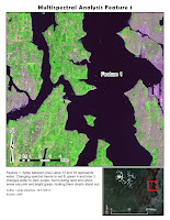
 This map shows the shallow waters along the coast to the West of the gap, located at x: 470000 and y: 3355000. The water West of the gap is much warmer, as shown by the yellowish striations. The water on the East side of the gap is much deeper, as shown by the blue color, lacking the warmth represented by yellow. The actual striation in the warm, shallow water are caused by waves and tidal action that is more pronounced in the shallow waters.
I found this feature as I was looking along the coast and I noticed that the seas side of the coastline showed a lot of temperature variation between the coastal water on the east and west side of the gap. After examining aerial photos, there did not seem to be any correlation between water temperature and urban development along the coast.
Using the band combination of Red 2, Green 1 and Blue 6, the warm, shallow water displayed in yellow. In contrast vegetation and most of urban areas display in blue, and cool , deep water pourple-blue.
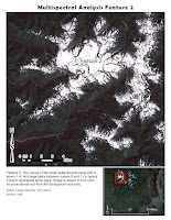 In Lab 7 we learned to locate and identify surface features based on their pixel value. Using tools provided by ERDAS Imagine Histogram tool I found the specific peaks in pixel values. Then using the Inquire Cursor I located areas on the image that matched those pixel values.
Then I identified those areas, and adjusted color bands to bring out areas of interest from their background. In the case of the second map, the snow capped mountain peak, no adjustment from true color was needed. This is because white snow cap clearly stands out from the mountain and vegetation color. Third image is that of shallow water with heavy sediment load. The challenge was to bring out the sediment pattern in the water. Under most band variations the sediment pattern was very difficult or impossible to distinguish from deep water. However using red 4, green 2 and blue 1, the eddies in the water popped out very clearly.
In this lab we used ArcMap and ERDAS Imagine to modify remote sensing data. This is done through application of various filters. The two programs used, ArcMap and ERDAS, provide certain benefits and work best when are used in tandem to overcome the limitations associated with each one.
In Module 5 we learned to calculate the relationship between wavelength and frequency, and to calculate the energy based on the wavelength. The basic principle is that the shorter the wavelength the greater the energy of the particle.
Then we were introduced to ERDAS IMAGINE software, and learned some of its basic utilities, including how to save your work without the software crashing.
Last part of the exercise was to use ERDAS software to select an area of a larger project area, calculate land area of each feature in it, and export it. Calculating land area involved editing the attribute table and adding another column. Then we imported the file into ArcMap, and created a usable map out of it.
 For my final project I compared images of the Lake Tahoe region from 1999 and 2010, and compared the land use/cover over those time periods. I used data provided for the final, which included images of the region in those two time periods.


