This week's assignment was focused on using labeling principles learned in the lecture to label number of features of Marathon, Florida. Using CorelDraw we were to import a map of Marathon, find locations we were given and label them. Then we had to insert all the mandatory map elements (title, legend, north arrow, author, sources) and an inset map. Last, but not least, we were to add three personal elements.
Finding the given locations was easy enough, with a plethora of maps available online. I chose to use an italic serif font to label all water bodies. Then I used a sans serif font to label all land features, I used all caps for natural features (keys), and title case for all cultural features. I chose green for the land color, as it is associated with land, and stands out against the blue water background. I used a stock image of deep water surface as the background image.
Labeling water features was simple, as I could fit the name within a feature. At most I had to create a curved path to label along. Both Florida Bay and Atlantic Ocean having the largest labels, being the most important water features on the map. Labeling key was more challenging, as I wanted to have the labels inside the features. This was impossible in couples of cases due to small size of the keys. I ended up placing the labels adjacent to those features, and wholly in the water. Most of the cultural feature labels were also placed in the water. In all cases of land labels, I placed a white halo around the text to make it easier to read, and to have the text stand out over some lines of low importance.
Saturday, January 31, 2015
Monday, January 26, 2015
Week 3 - Cartography Using a GIS
This week we created three maps of Mexico: population by state (shown by state), rivers and transportation routes, and topography. The purpose of the lab was to manipulate the metadata, show certain values and hide others. Also learning to label features, adjust the labels, and in general make the map legible and easy to look at.
This map shows the population of Mexico by state. The graduated color range represents the population, from light yellow being the least populated, to dark red representing the most populated. Shades of yellow to red stand out on the background of light green and blue, bringing focus to Mexico. Also I have adjusted the population ranges to cut off at nice even numbers, so they are meaningful to the reader.
Saturday, January 24, 2015
Module 3: Cartographic Design
This week's assignment was to create a map of school in Ward 7 of Washington D.C., and incorporate into it various aspects of graphic design. The map shows elementary, middle and high school in Ward 7, in relation to city streets, highways, water bodies and parks. The larger the school symbol, the more advanced the school, with the largest symbol being used for high schools.
This map was created in ArcMAP. To clear up the background of the map I removed the the surface streets from Washing D.C., but kept the ones in Ward 7. Then I changed background colors of both D.C. area and areas off the map. To contrast this, I used light green as the background of Ward 7, with darker green representing parks. This color let the red school symbols stand out.
This map was created in ArcMAP. To clear up the background of the map I removed the the surface streets from Washing D.C., but kept the ones in Ward 7. Then I changed background colors of both D.C. area and areas off the map. To contrast this, I used light green as the background of Ward 7, with darker green representing parks. This color let the red school symbols stand out.
Monday, January 19, 2015
Week 2: Own Your Map
 |
| Location of UWF Campus in Escambia County, Florida. |
Saturday, January 17, 2015
Module 2 Lab: Introduction to Graphic Design
 |
| Map of Florida, including the state seal and state tree. |
The purpose of this assignment was to create a map of the state of Florida for a children's encyclopedia. The map was to contain counties, water bodies, cities, capital, as well as map basics such as an author, sources, north arrow, legend and scale. Additional information I chose to include is the state seal, state tree and the state nickname.
I used CorleDRAW x7 for this assignment. After exporting the map I duplicated the scale, and moved it to a separate layer from the map itself. This let me move the scale around, I just had to be careful not to change its size, or the map's. Then I added a drop shadow to create a darker outline around the state. In the end I imported images of the state tree and state seal.
Sunday, January 11, 2015
Module 1 Lab: Map Critique
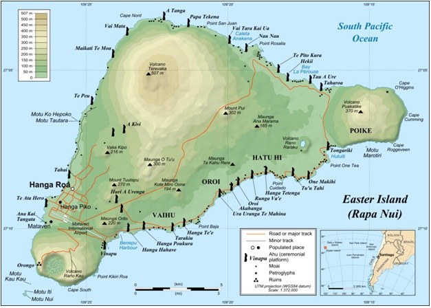
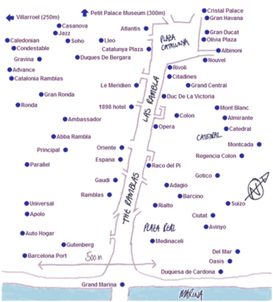
Below are examples of two maps, one well designed and one poorly designed.


The above is a (mostly) well designed map of the Easter Island. It is well laid out, with the legend and map insets being placed in areas that otherwise would have no data. The data on the map itself if presented clearly, in a legible, uncluttered fashion. The color gradient for elevation makes sense, as it becomes lighter and browner as the elevation increases. Likewise, all labels were placed, if possible, in areas with no other data (in the ocean in this case). The one flaw with this map I can see is the lack of North arrow.
***
This a good example of a poorly designed map. The map does not provide any information about what it is supposed to represent. There is no title or legend. No information about the area represented, where in the world it is. Without streets, this map only shows locations of points in relation to each other. The scale and north arrow look like they have been added as an afterthought, after this map was created, which makes the information they provide seem suspect. Its like they are there because they are supposed to be there, but not because they are actually part of the map.
Friday, January 9, 2015
Week 1: Orientation Assignment
Here is my very first map. I was surprised how user friendly the basic utility of ArcGIS is. I chose shades of green for population density because the colors stand out from the city symbols. When I first used yellow>orange>red color scheme, the dark red high population nations made city symbols illegible in high city density areas.
Overall very fun project and a good intro to the software.
Overall very fun project and a good intro to the software.
Thursday, January 8, 2015
Lukas' Introduction
Who am I and where do I come from?
My name is Lukas Zarychta. I am Polish, and English is not my native language. Currently I live in Baton Rouge, Louisiana, with my wife and two cats.
I have a bachelor degree in both Anthropology and Geography. I am an archaeology field and lab tech, with years of experience in both. I have work on a wide range of archaeological projects, ranging from surveys through what I can only describe as death-swamps, 10,000 year old aboriginal sites, and 19th century sugar production facilities and slave quarters. Having been on the receiving end of GIS, I want to be where the magic happens, as they say.
Subscribe to:
Comments (Atom)


